Guest post by Jennifer Gonzalez
 As the parent of three elementary students, I get a lot of classroom newsletters. And every time I get one, I fully intend to read it. I know how important it is to keep track of school activities, to know what my kids are learning, and to support their teachers.
But I don’t always do it. I put the newsletter into a pile of important papers, and other papers pile on top of it, and far too often, I just don’t get to it.
My own disorganization can take some of the blame, but I’m sure my reading would be more consistent if the newsletters were designed differently. If you suspect parents aren’t really reading what you send home, see if your newsletter suffers from one of these five flaws.
Five Common Newsletter Flaws
1. It’s too wordy.
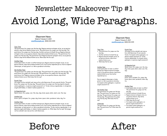
People are really, really busy. So if your newsletter is comprised mostly of long paragraphs, parents are less likely to read through the whole thing.
A paragraph can be “long” in one of two ways: The first is that it simply contains too many words, too many sentences all pushed together. If you want parents to send kids to school with warmer coats, they might miss that request if it’s buried in a five-sentence paragraph about how cold it is. When you want a message to stand out, cut down on the chit-chat as much as possible. Breaking paragraphs into bullet points also helps.
The other meaning of “long” is more literal: Magazine designers know that long lines of type are harder to read, and they try to limit themselves to 9 to 12 words per line. If you want more parents to read your newsletter, format it in columns.
2. It’s too crowded.
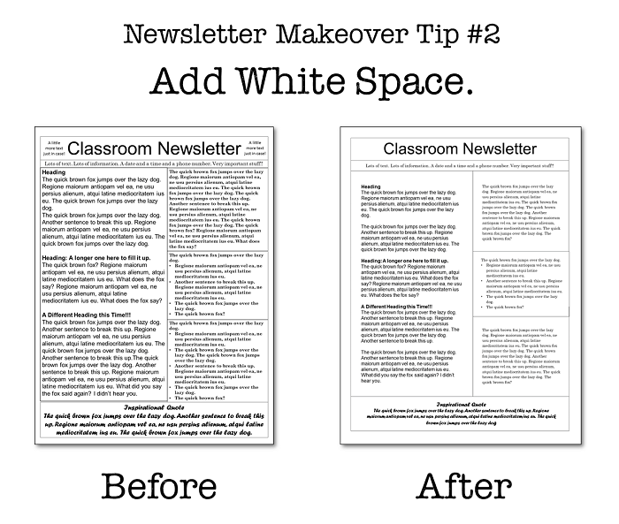
If your newsletter has very little white space – the space on the page that contains no text or graphics – your readers will have a hard time getting through it. White space not only makes reading easier, it also helps important elements stand out.
Adding more white space to your newsletter can easily be achieved by increasing your page margins and the space around individual blocks of text or images. If you find you have too much text to add sufficient white space, reduce your font size a little bit. You’ll be amazed at what a difference it makes to move from 12-point to 11-point. And if you can say the same thing in fewer words? Even better. Think of it like a resume: If you can’t get it all on one page, start cutting words to make it fit.
3. It’s loaded with recycled content.
Some newsletters include the school mission statement, the class motto, the daily schedule, and a blurb about the class website in every issue. After a few newsletters, I don’t even see this stuff anymore; it’s just a lot of visual noise. Then there’s other content that changes only slightly each week: spelling lists, specials schedule, math topics. This information is important, and as a parent, I go straight to the newsletter if my son loses his spelling list or we don’t know if my daughter should wear sneakers the next day. But that’s the thing – I go to the newsletter when I need this information. The newsletter is not always interesting enough for me to read it for its own sake.
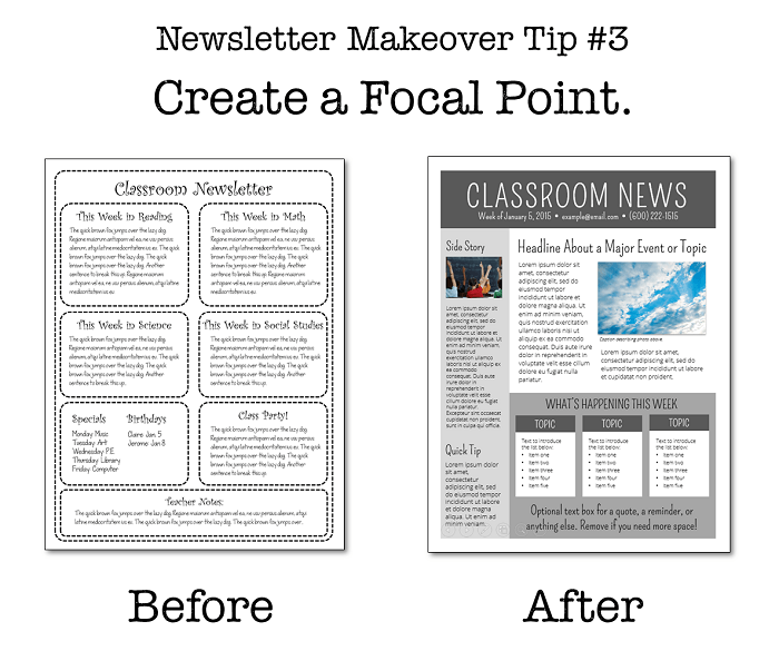
To draw parents’ attention to the truly new content – the announcement of an upcoming field trip, your enthusiastic report on students’ science projects – that content needs to stand out.
Create a focal point in your newsletter for the most important, freshest story, and push the repeat information to less-prominent spots on the page.
4. It’s a cacophony of clip art.
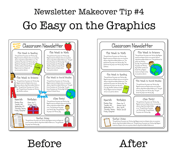
Clip art can be pretty irresistible. There’s so much adorable stuff out there, and adding it to your newsletter breaks up what would otherwise be a big, boring block of text.
But too many graphics make your newsletter a mess. And if you use the same exact clip art from week to week, the newsletters will be indistinguishable from one another. Take a “less is more” approach and include just a few pieces of art. Or consider using student or classroom photos instead: Remember, your readers are adults, so it’s possible they might be less drawn to adorable clip art than the kids are.
5. Parents don’t know what to do with the information.
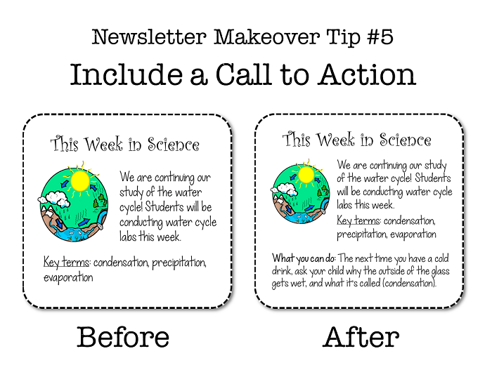
All advertisers are familiar with the term “call to action.” It’s the thing they ask you to do at the end of an ad – try their product, ask your doctor about a certain medicine, or visit the company website. By giving the recipient something to do, the call to action ensures that the relationship doesn’t end with the ad.
Although you’re not selling anything to parents, you probably want them to do something with the information you send home. But unless you tell them, they won’t always know what that is.
Here’s where the newsletter can be a powerful instrument in the parent-teacher partnership: The next time you write your newsletter, consider what you ideally want parents to do as a direct result of reading it. Then include that information.
Putting together a classroom newsletter takes valuable time from your day, but by applying these lessons to your next issue, you’ll make sure it is time well spent. An effective newsletter will strengthen your partnership with parents and ensure your students keep learning well after they’ve left the school building.
Free Newsletter Templates
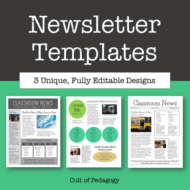
If you’d like some help with layout, try one of the clean, contemporary designs in my free Newsletter Templates pack, available in my TeachersPayTeachers store. It’s completely editable and customizable to fit your own style and taste. Whether you use my templates or create your own, remember to avoid these five common flaws to make sure your newsletter doesn’t end up at the bottom of the pile!
Jennifer Gonzalez is the creator of Cult of Pedagogy, an online magazine for teachers of any subject or grade level. In Jennifer’s words, “Teaching is an art, a craft, and a science, and perfecting it is an ongoing, endless process.” Visit Cult of Pedagogy to read more of her insightful posts!

